Mobile App
Research & Visual Design

TRAVELER
Traveler is a mobile AND APPLE WATcH app designed for tourists in San Francisco, so that it may better support THEM iN discovering THE CITY.
CHALLENGE
Visual Identity (Individual)
In this project, I was challenged to create a visually unified brand system for a transportation application. I was asked to define the product’s user interface layout and structure.
Evaluative Research (Team of two)
The goal was to learn how to evaluate designs with people to gain valuable feedback on our product and concept. We selected my existing Traveler mobile app to iterate on, and ensure usability.
SERVICES
UI/UX Design, Research, Branding, Visual Design, Usability Testing, Prototyping
__
ROLE
Lead Product Design, Co-researcher
Design research partner: Tara Chandi
__
PROJECT LENGTH
4 weeks

_
CONCEPT
TRAVELER MOBILE APP

TRAVELER APP
Tourists can browse popular destinations, local events and the best places to grab a bite. They can then use the app to navigate to their destination along with viewing the best routes parking and bike rental spots in the city.
APPLE WATCH APP
Tourists can get directions and keep up with their travel schedule through their apple watch app. It will prompt them with turn-by-turn directions and inform them whenever they reach their destination.
_
PROJECT TIMELINE

_
BRAND IDENTITY
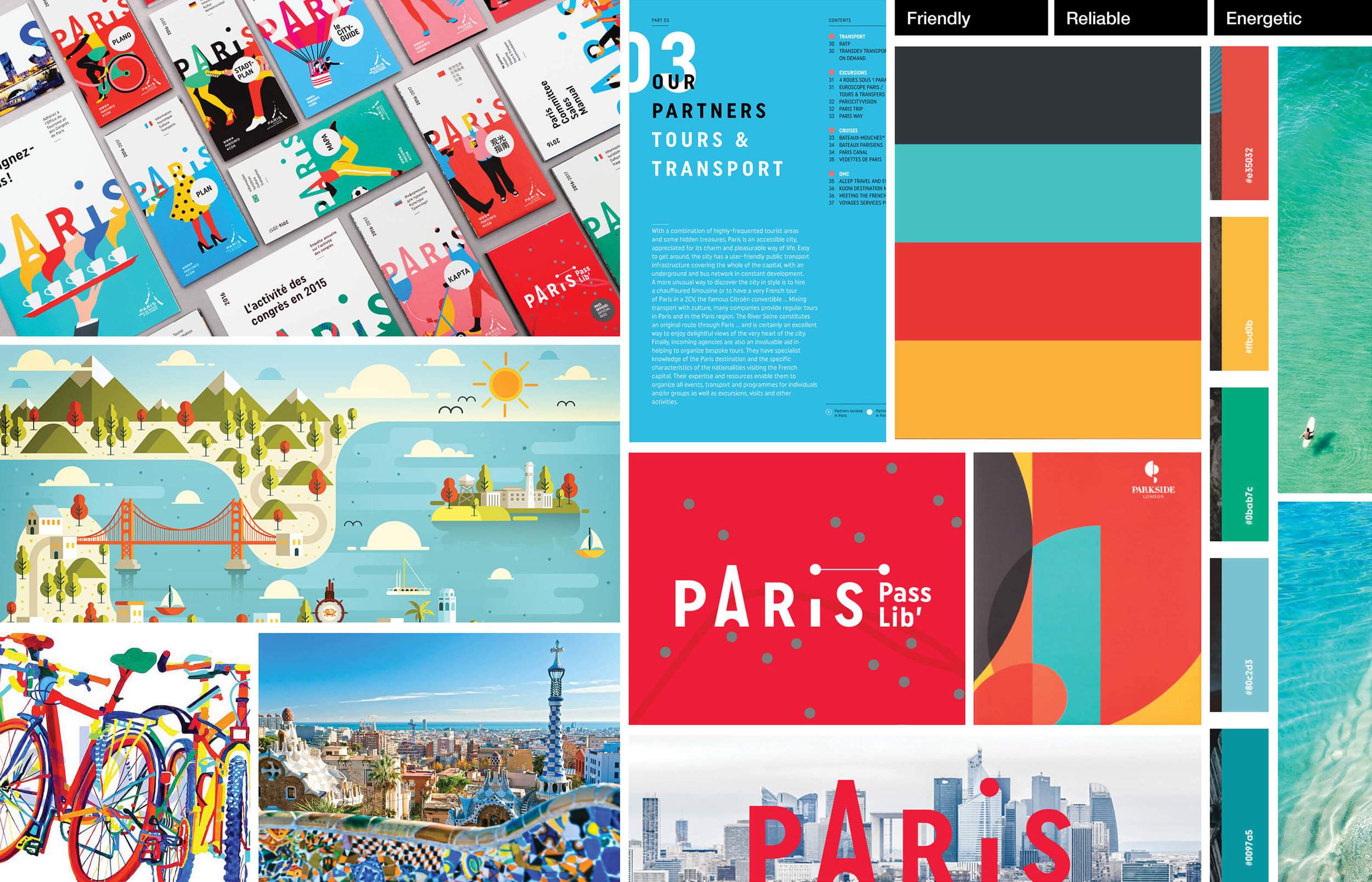
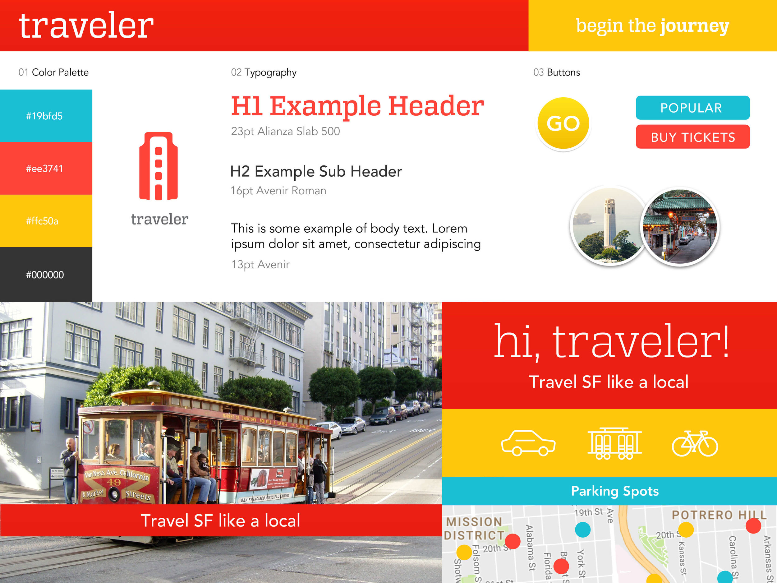
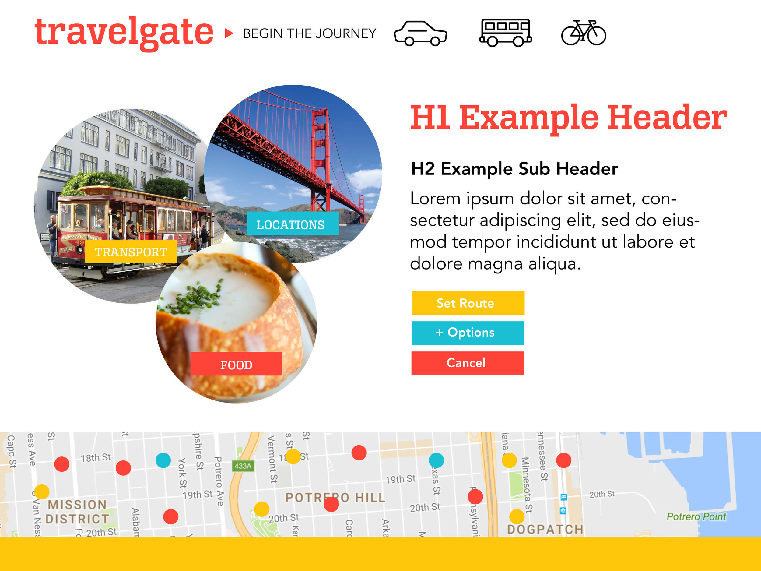
My primary focus was to provide users with a vibrant and memorable experience of San Francisco while navigating through the Traveler app. I reinforced this experience through an energetic color palette and a logo that identified the city and the action of traveling.

MOODBOARDS & STYLE TILES
_
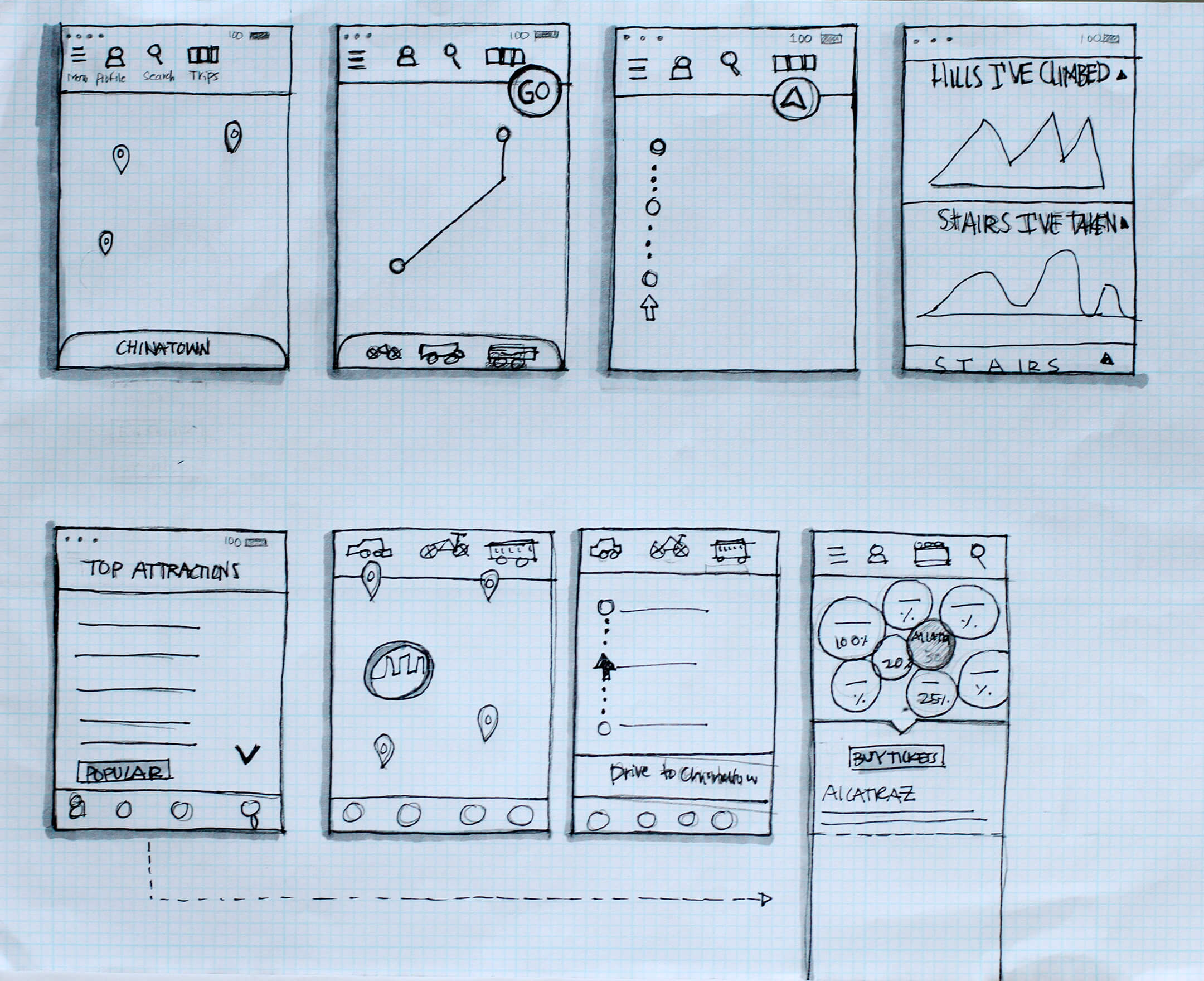
PROTOTYPING
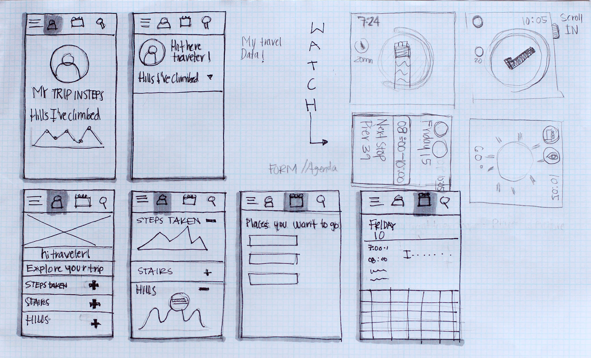
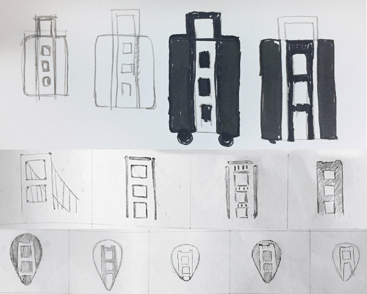
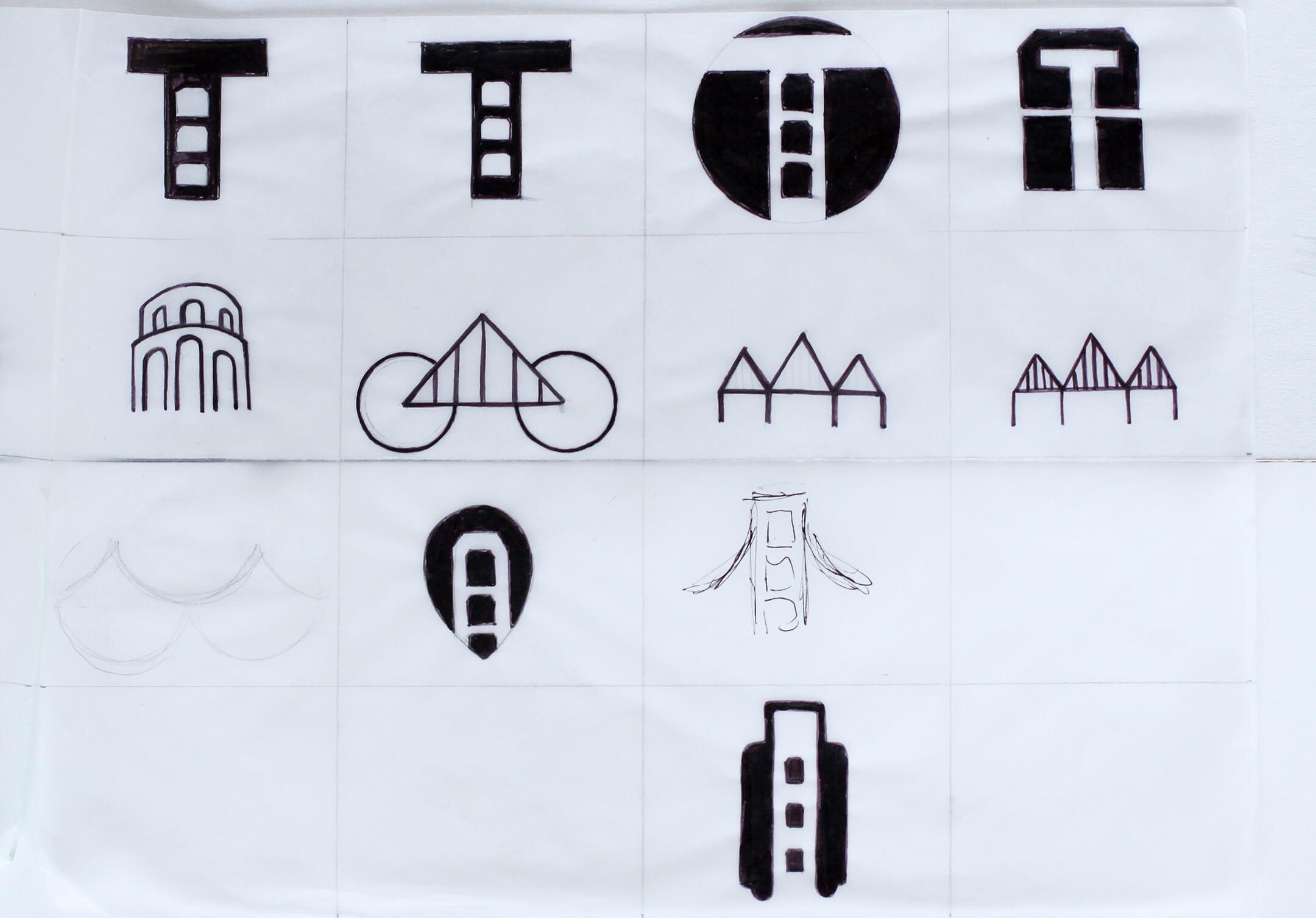
I experimented different concepts for the home and navigation section of the app. It was important to ideate on the most efficient way for users to navigate and arrive at their desired destination. For the logotype, after several iterations and based on feedback, I landed on a visual abstraction of an important landmark of the city.
_
USABILITY TESTING
For our usability testing, we decided to focus on the Traveler mobile app. We conducted two rounds of user testing, in the first round we ran 5 usability tests through usertesting.com. In the second round, we interviewed 4 users in person. We focused on how the users interacted with the Traveler app. We questioned if tasks flowed intuitively to be completed and if users were able to get from point A to point B.

_
SYNTHESIS
We synthesized our findings and observations into insights and then used the metrics below to categorize them into a matrix. The metrics helped us organize our findings and record them digitally. We were able to reference it several times while redesigning our flows and screens.
Relevance
High: Blocks the user from achieving task
Medium: Creates a delay and increases frustration Low: Does not affect task flow
TYPE
Cosmetic: Visual design
Usability: Changes in function
Positive Finding: User specified liking this New Feature: User suggested this idea
EFFORT
High: Cannot be implemented by May 4th, 2014 Medium: Takes less than 4 hours
Low: Takes less than 20 mins

Example of metric modeling
PRIORITY MATRIX

This matrix shows several of the insights that we implemented in the redesign of the screens. We chose not to implement changes that were present in quadrant 2 ( Low relevance and high implementation effort) as we felt they did not drastically improve the overall experience.
_
REDESIGN
After our second round of testing, we redesigned several screens. Based on feedback from users, we added two new screens and altogether removed the fitness feature.
TASK 1: Use the app to navigate to Coit Tower by bike
TASK 2: Explore the profile section

_
CONCEPT POSTER

