Customer Support NEW

PHIL
Product Design | 2019
Phil IS A MODERN RX DISTRIBUTION PLATFORM. IT’S BUILT TO LOWER
SYSTEMIC COSTS AND IMPROVE PATIENT OUTCOMES.
Summary
Phil has made an effort to make the patient sign up experience as effortless as possible. With this goal in mind we have iterated on different versions of what we call our “Sign-up Funnel”.
Challenge
Phil operates in the healthcare space, our sign up experience needs to inform the patient about our service and also request a significant amount of information from them. Our main challenge is how can we make this sign-up experience as short and easy to follow?
Role
Product Designer
—
Services
UI/UX, Visual design,
Research
—

PROCESS
Before and After
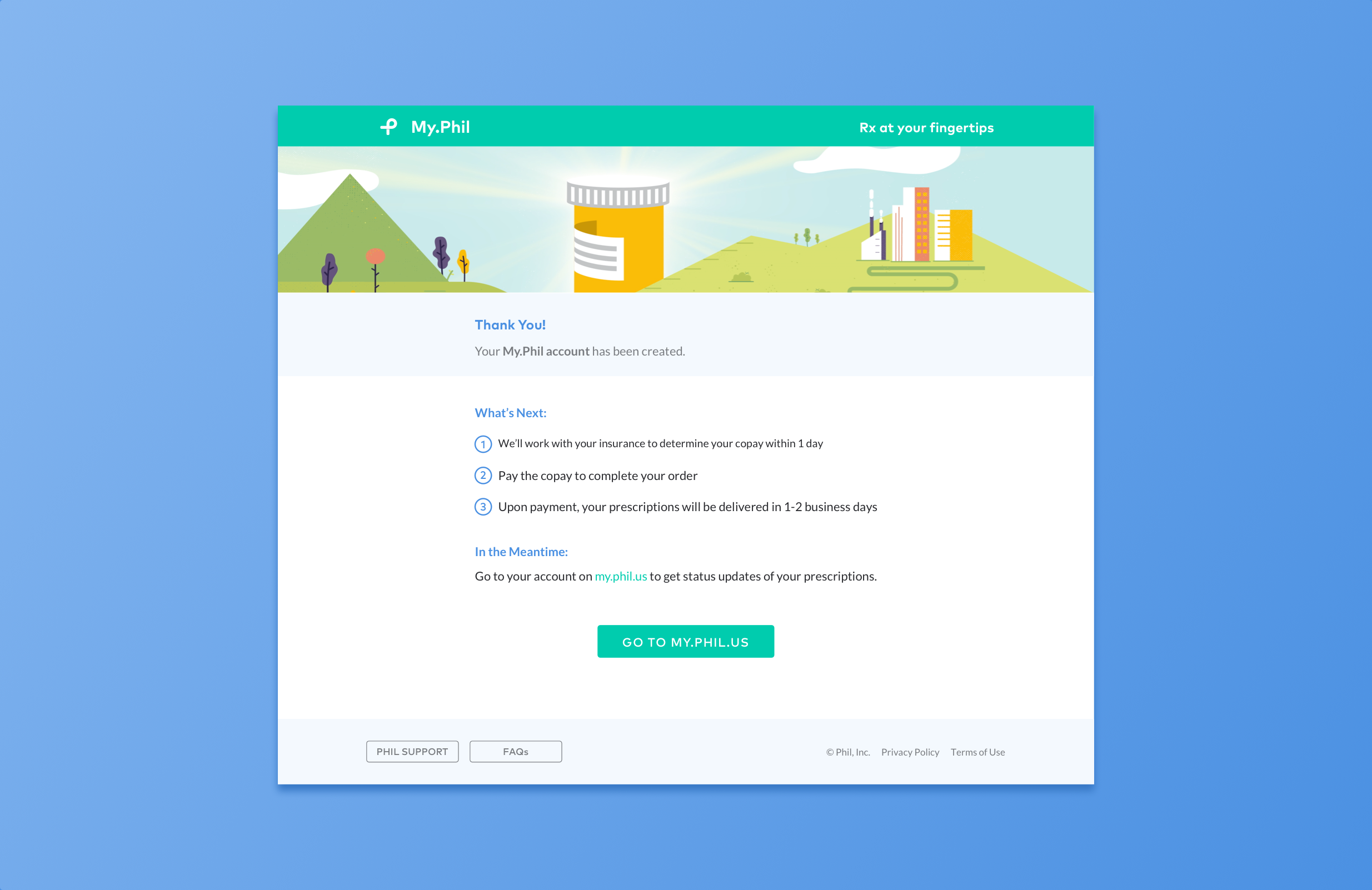
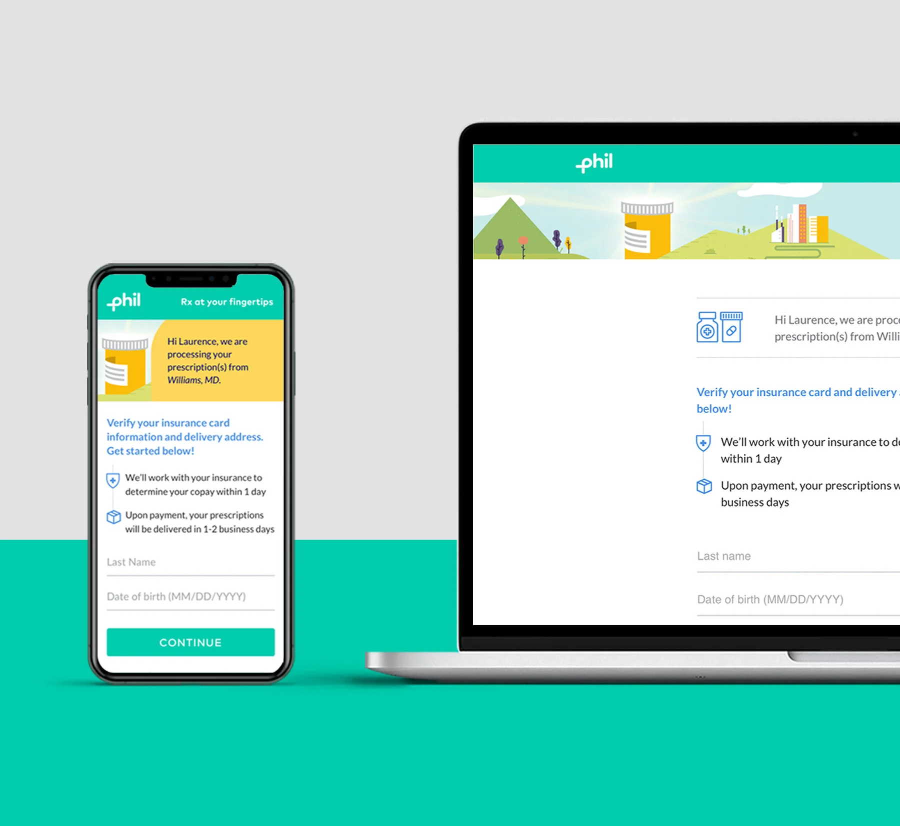
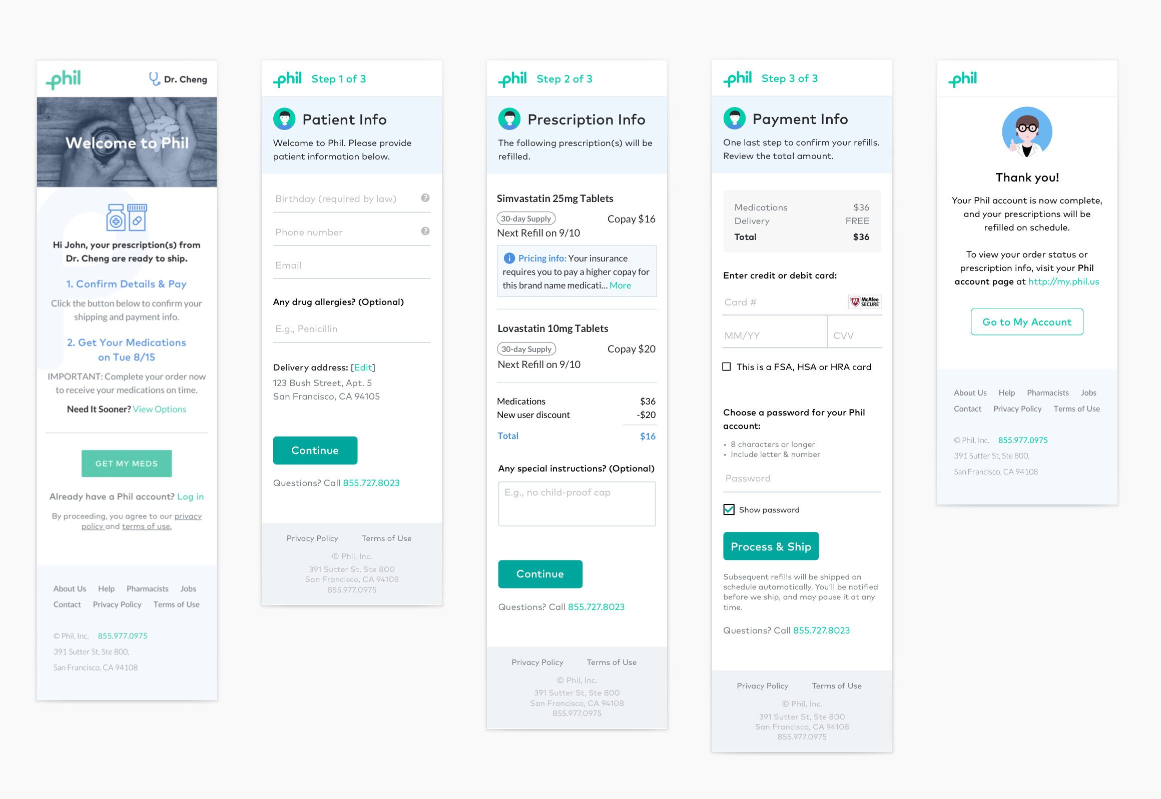
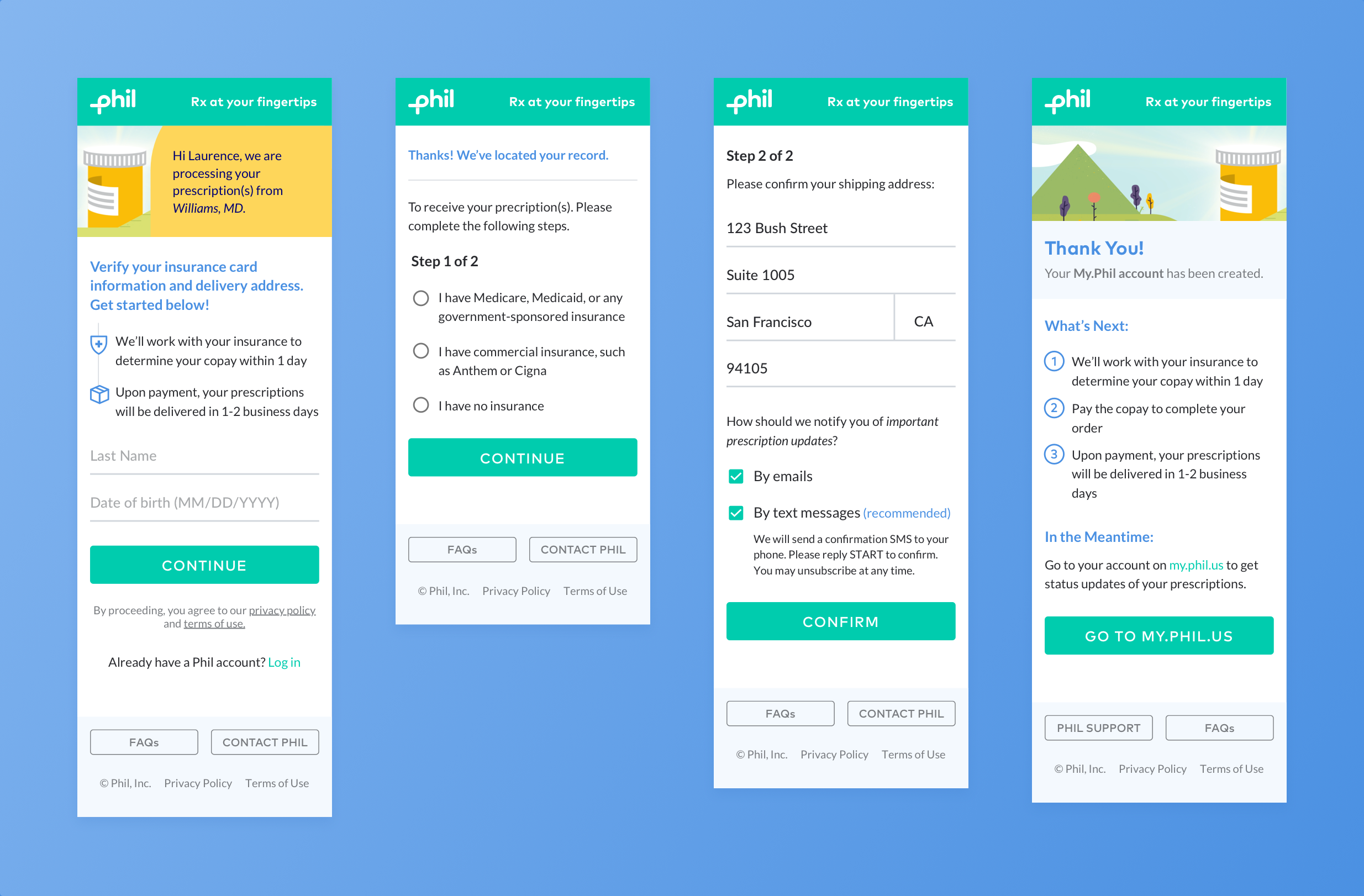
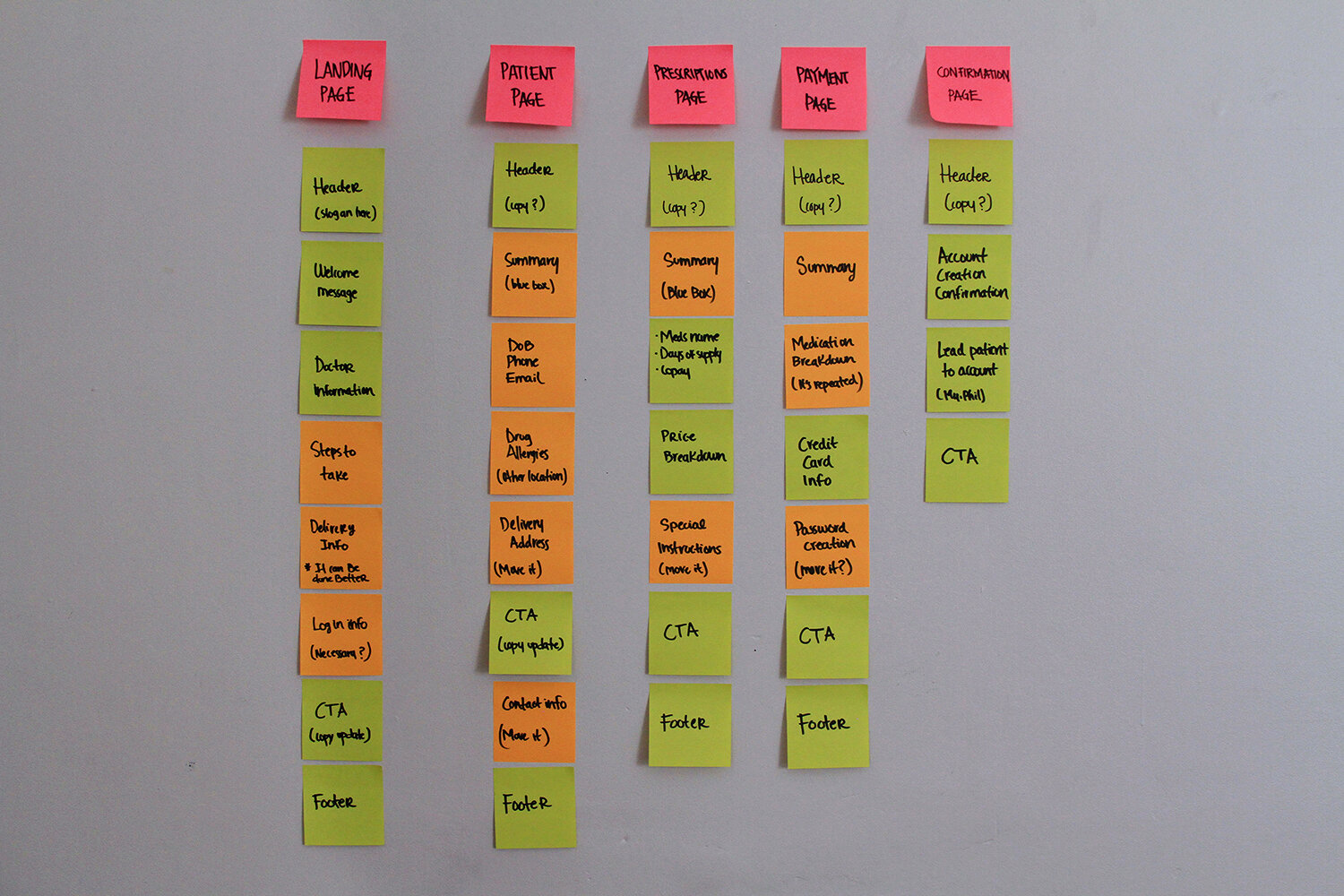
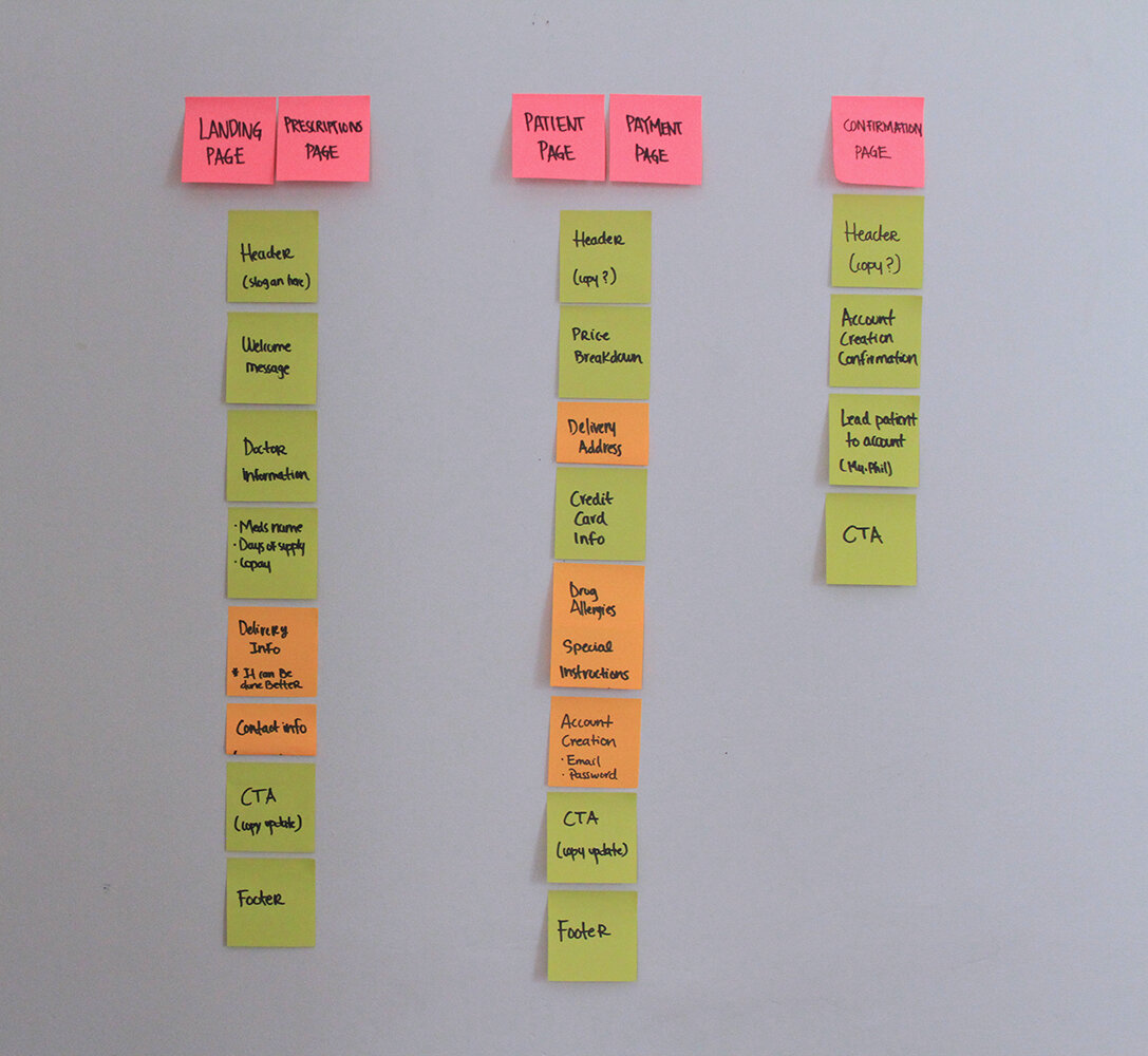
When I first arrived to the company our Sign-up Funnel followed the design on the left. The previous experience involved 5 steps, we reduced the total number of screens to 3, which means we also reduced the number of steps the user takes to complete the funnel. At the same time we took this opportunity to redesign the look and feel of the screens, I used illustrations instead of photography for a friendlier approach. The header was updated to reflect our branding.
Research
Current users were dropping off from the experience and not completing the funnel. Our hypothesis was that the experience was unnecessarily long. There are some questions to be considered as we approach the redesign. In order to arrive to a better Sign-up Funnel, we decided to map out the current experience and iterate from that one.
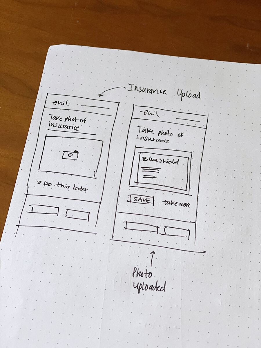
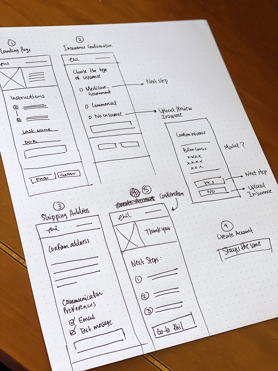
Sketches
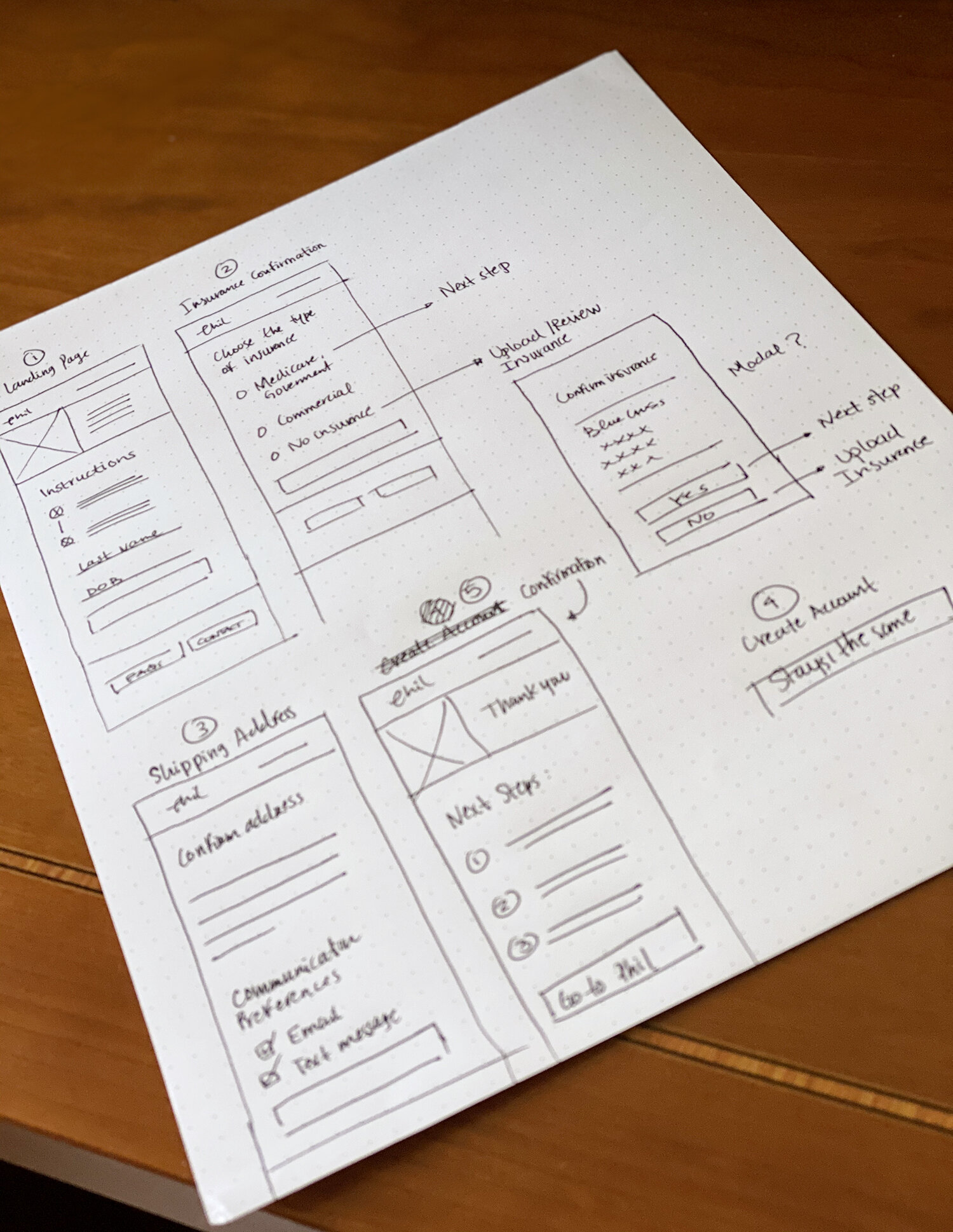
Wireframes
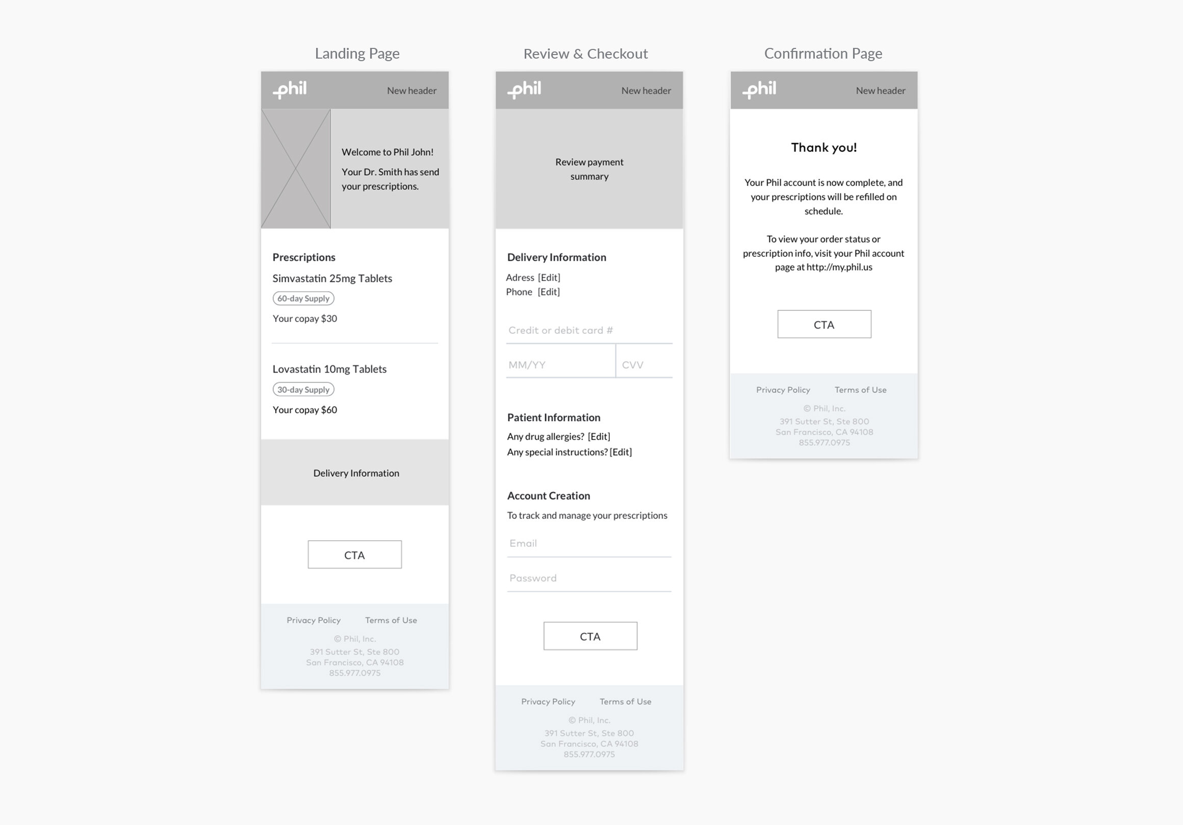
Responsive Design


